Tak Shtab
Charitable organization
Tak Shtab

The NGO “Tak Shtab” is an initiative launched by a group of ordinary young Kyiv residents who came together after February 24 to support those who need it most: internally displaced mothers with children, the elderly, the military, and even animals. It’s an informal hub of care, solidarity, and belief in victory.

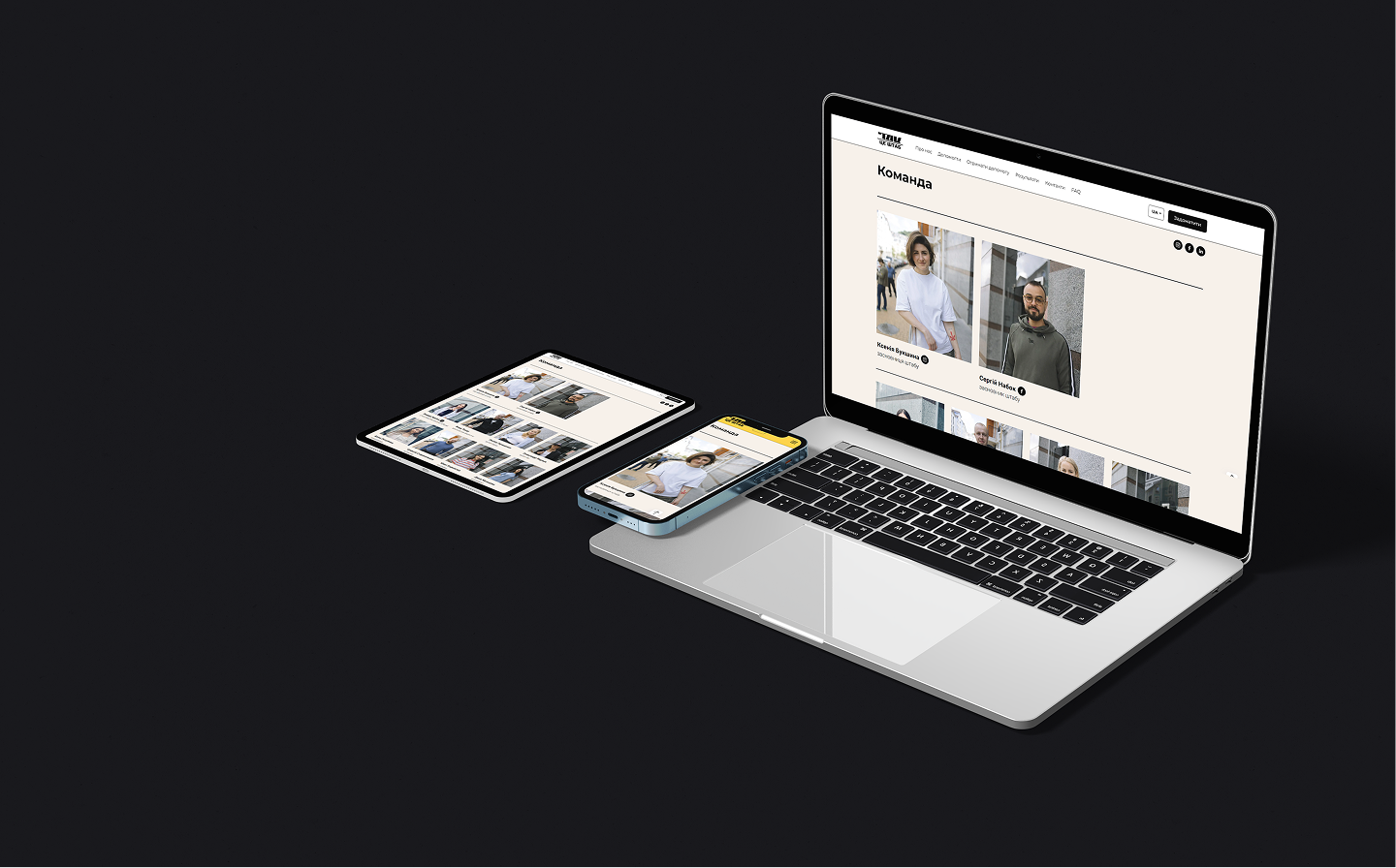
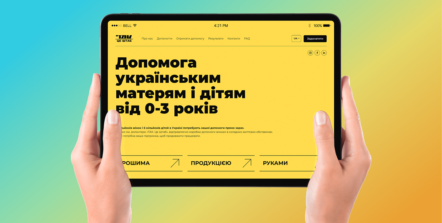
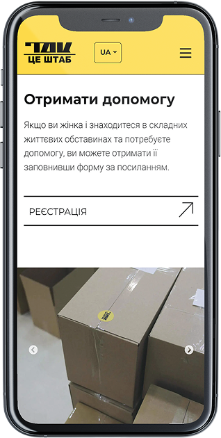
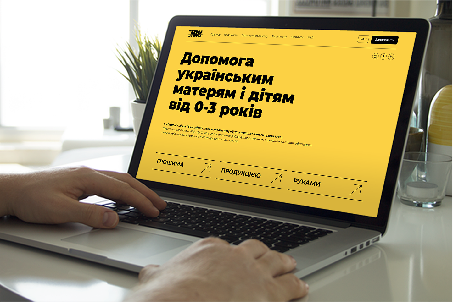
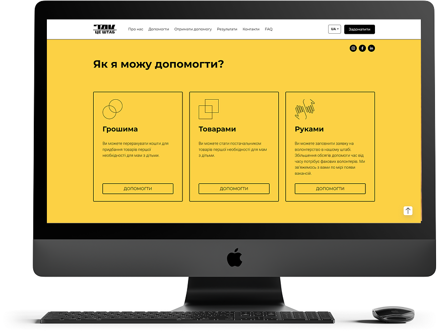
The challenge: As part of this caring and courageous community, we joined the process of creating a simple, honest, and emotionally resonant visual presence for the organization online. We adapted the existing identity and developed a functional website based on it. The result is a truly convenient tool for connecting those in need with those ready to help.

The website includes:
– a simple request form for humanitarian aid,
– dedicated sections for sponsors and volunteers,
– clear navigation and a lightweight structure that informs rather than overwhelms,
– a “no-frills” design that preserves the emotion of a grassroots initiative.

Result: A website that serves as an effective point of connection between people who care. Quietly, confidently, with faith in the ordinary life that will surely return.
Client
Tak HQ, NGO
Year
2022
Role
Design
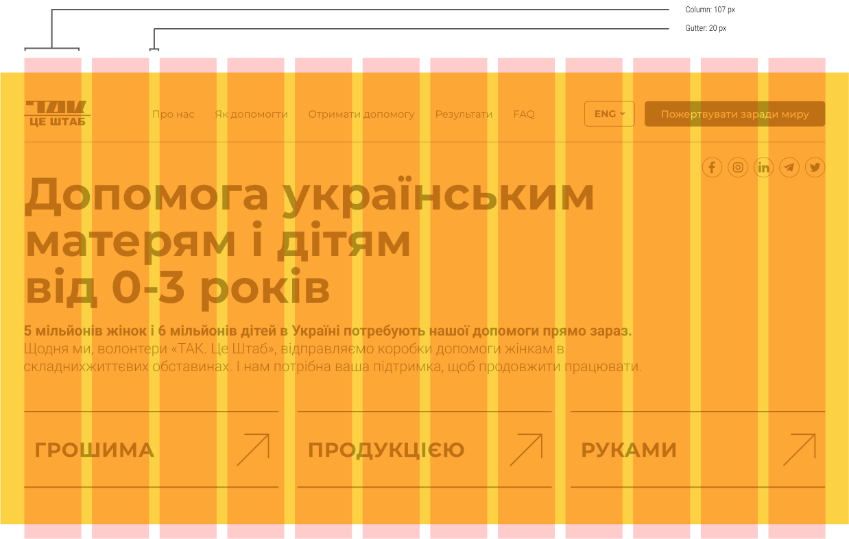
GRID SYSTEM
In this project, we developed a classic grid system that ensures clear content structure, responsiveness, and easy navigation for different types of users.
RESPONSIVE DESIGN
We used responsive design. The interface adapts to the device's resolution.
BUILT WITH MOBILE IN MIND
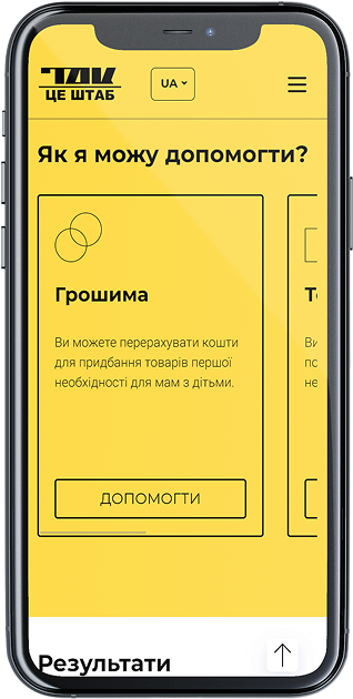
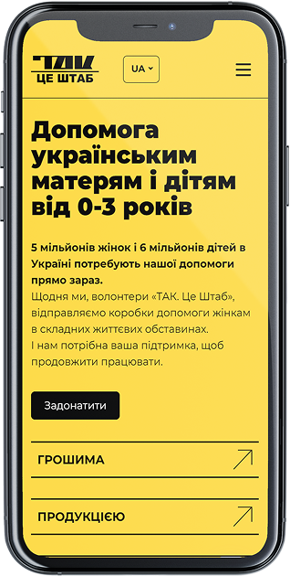
As with most of our projects, the mobile version of the site was designed first — with a focus on intuitive navigation and quick access to key features. The interface is optimized for touch interaction, loads quickly, and remains highly readable on small screens.
USER-FOCUSED
We optimized the site’s interface for every screen — from smartphones to tablets and desktops. It runs smoothly, looks modern, and feels as intuitive as a mobile app.
Montserrat TYPEFACE
The Montserrat typeface is a modern geometric grotesque inspired by the traditional signage and lettering of the Montserrat neighborhood in Buenos Aires. It combines clean shapes with strong readability, making it suitable for both headlines and body text.
THE MAIN COLORS
The primary colors were selected in line with the brand’s corporate identity
#fcd144
R252 G209 B68
#000000
R0 G0 B0