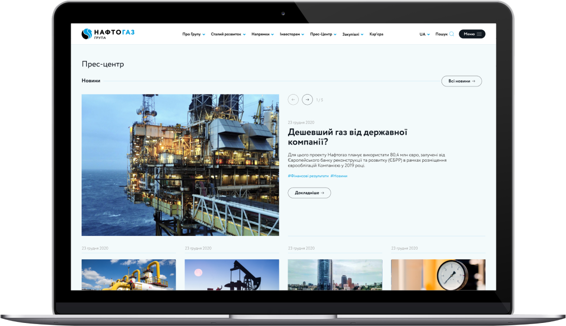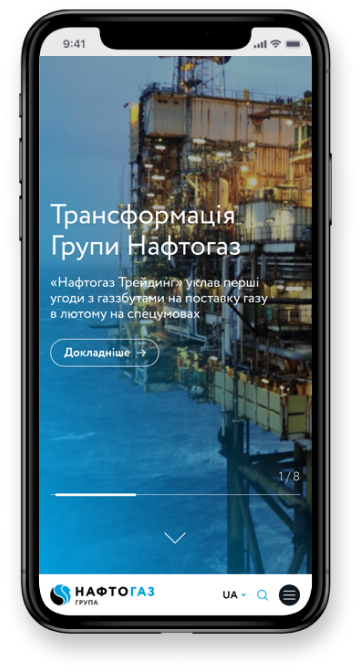

NJSC Naftogaz of Ukraine is the national joint stock company responsible for the extraction, transportation, storage, and supply of natural gas. It is a key player in ensuring the country’s energy security and one of the largest state-owned companies in Ukraine, with a complex structure, diverse audiences, and a high level of public attention.
The challenge: To create a modern, transparent, and functional corporate website that communicates effectively with a wide range of target audiences — the general public, media, partners, investors, employees, and government institutions. The site was envisioned as the company’s central information hub, while also meeting high standards of security, stability, and accessibility.
The project included:
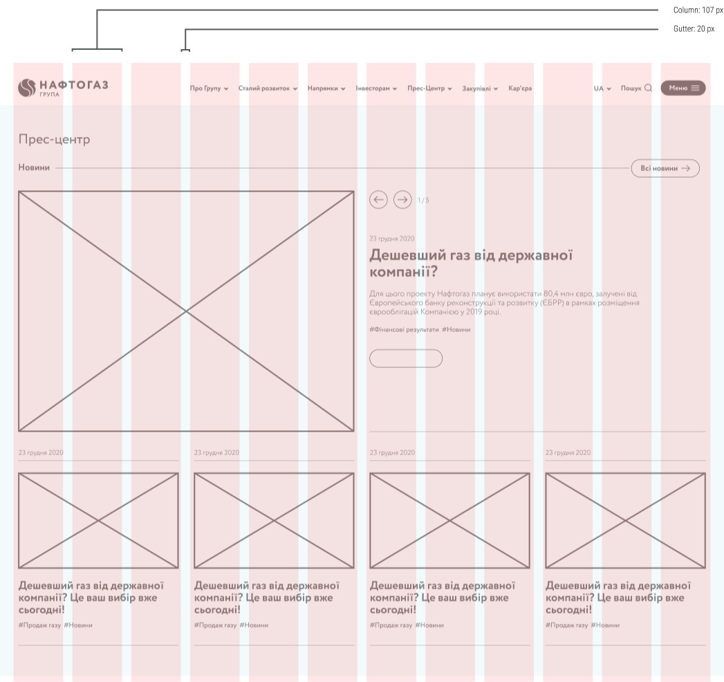
– a scalable structure covering dozens of business areas, divisions, and news streams,
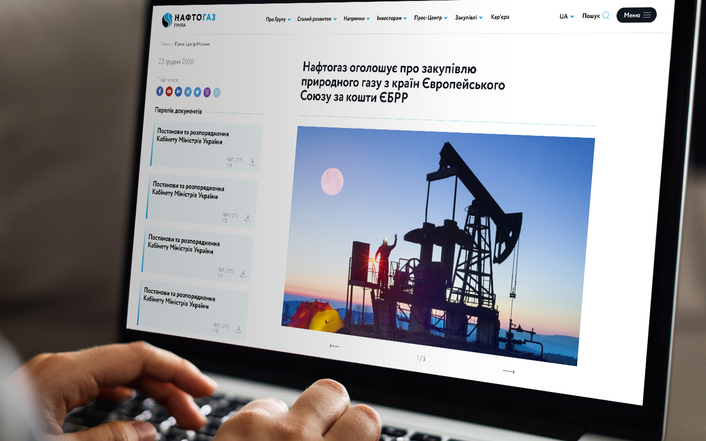
– dedicated sections for media, investors, careers, procurement, sustainability, and reporting,
– intuitive multilingual navigation (Ukrainian / English),
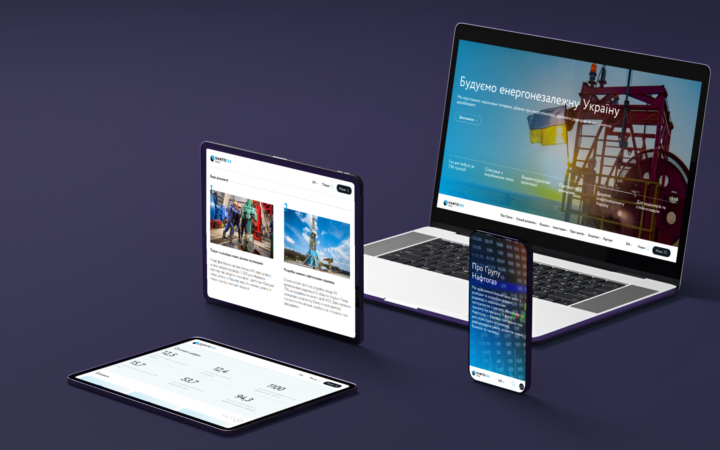
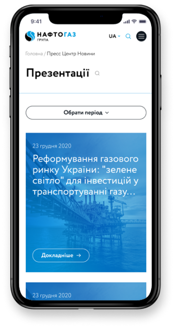
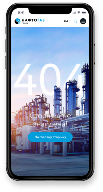
– fully responsive design for all device types,
– a scalable CMS for managing large volumes of content,
– full compliance with WCAG accessibility, SEO, and cybersecurity requirements.
The result: The Naftogaz corporate website became an open, modern, and user-friendly digital interface for Ukraine’s largest energy company. It ensures fast access to relevant information, strengthens the company’s reputation internationally, and supports its communications in a dynamic and high-responsibility environment.
