Orwell Consulting
Reputation Agency
Orwell Consulting

Orwell Consulting is a reputation marketing agency operating at the intersection of strategic communication and informational influence. Its mission is to build, protect, and reinforce the reputation of individuals and brands in a world where truth is once again a value. The name references George Orwell and invites us not to shy away from speaking directly about meaning, power, and control.

Main objective: To create an identity rooted in history and driven by a strong ideological core, based on the visual aesthetics of the 1950s–60s — an era when the first global communication campaigns were taking shape and information was turning into a weapon. The visual style had to combine institutional gravitas, analytical clarity, and a distinctive retro tone — tailored for today’s business and political leaders.

The project included:
– a logo and graphic system echoing the symbolism of 1984,
– a mid-century modern palette: monochrome, red as a warning, and accents of office beige,
– typography inspired by typewriters, pop-art posters, and vintage newspaper layouts,
– business collateral designed to resemble reports, manuals, and declassified documents,
– infographic principles based on strict grid structures and Cold War-era visual codes.

Result:  Orwell Consulting received an identity that doesn’t embellish — it establishes authority. A visual system unafraid to appear serious — and precisely for that, it earns trust. A style that compels not just to read, but to pay attention.
Client
Orwell Consulting
Year
2024
Role
Design
LOGO
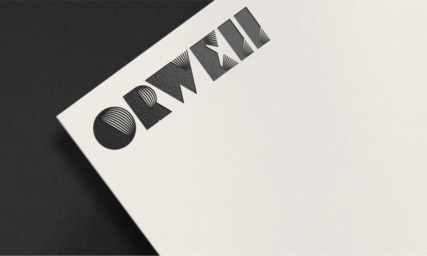
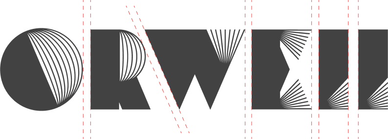
The Orwell Consulting logo is a graphic interpretation of the name, featuring references to optical art, typographic experiments of the 1950s–60s, and poster design from the Cold War era. Horizontal and radial lines evoke a sense of surveillance, influence, and signal—core elements of the Orwellian narrative. Visually, the logo resembles an editorial stamp or a classified marker, seamlessly fitting the identity of an agency that deals with meaning, reputation, and public positioning.
ELEMENTS OF CORPORATE IDENTITY
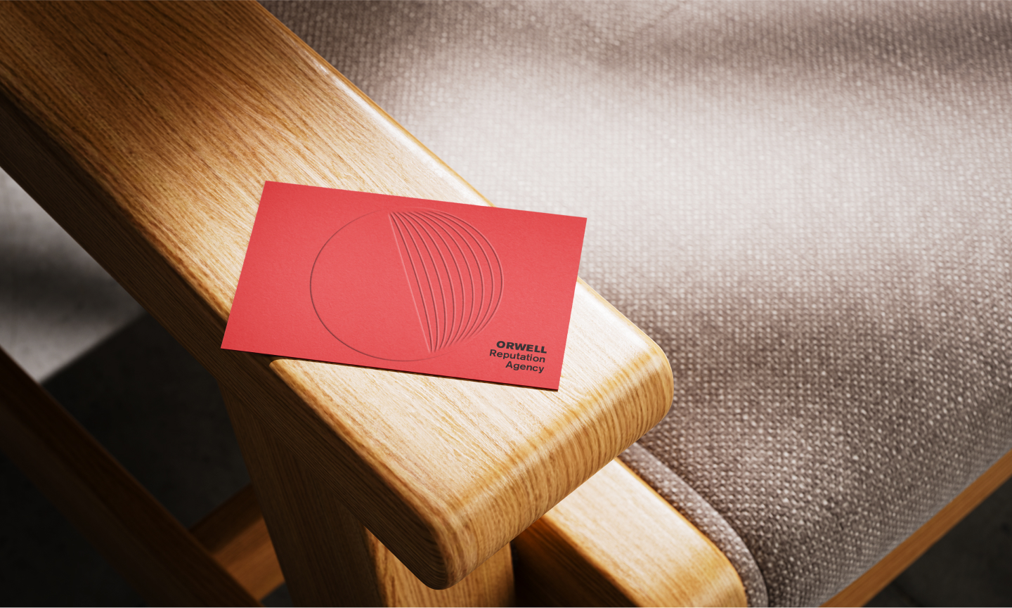
Key elements — business cards, letterheads, envelopes, and accompanying materials — are designed with a strict, functional aesthetic. Graphic accents echo the visual language of mid-20th century propaganda materials. This is a style that serves not only form but also meaning — creating an atmosphere of control, analysis, and confidence in every detail.
VISUAL COMMUNICATION
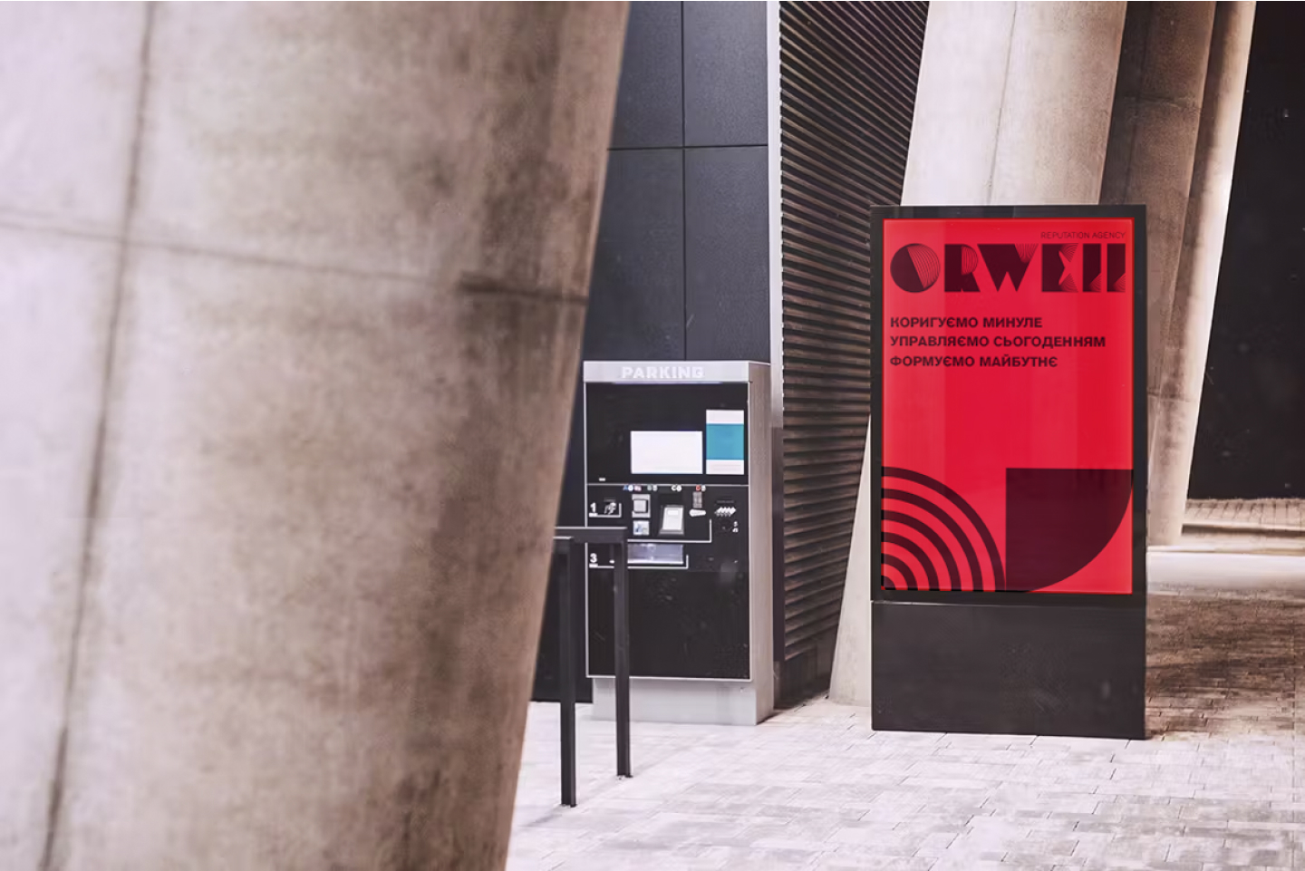
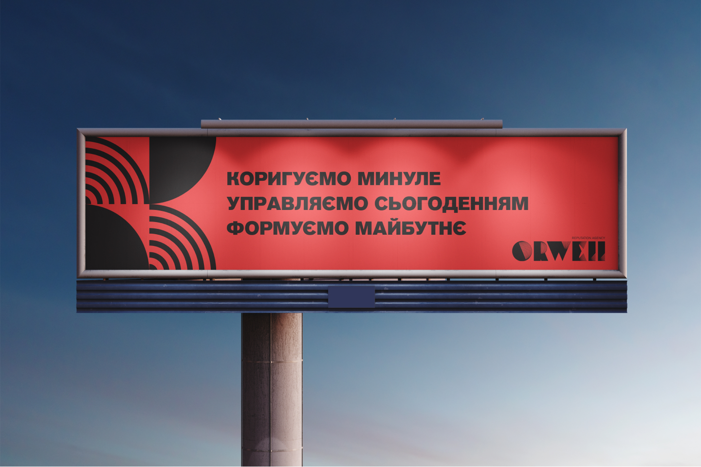
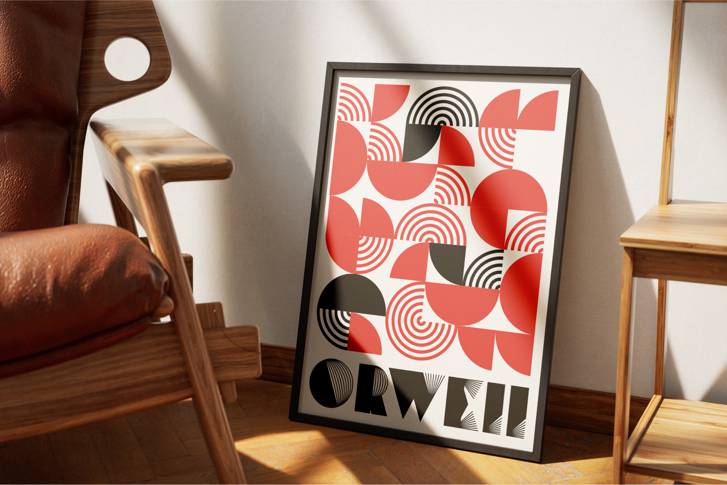
Програма ChatGPT сказала: The visual communication elements of Orwell Consulting are defined by ideological clarity, structural rigor, and historical allusions. The geometric pattern of concentric arcs and quarter circles creates a visual metaphor for informational power. The composition scales seamlessly across outdoor advertising, presentations, and digital media, maintaining strong recognizability and conceptual depth.
Akzidenz Grotesk
Akzidenz Grotesk is a classic sans-serif grotesque typeface, created in 1896, that became the foundation for many modern fonts.
THE MAIN COLORS
The color palette creates a mentor-like visual language — one that doesn’t embellish, but rather warns, structures, and compels the viewer to take information seriously.
#fe413f
R254 G65 B63
#1e1f1f
R30 G31 B31