Fire does not burn the fierce
Charitable Foundation
Fire does not burn the fierce

"The Fire Does Not Burn the Fierce" is a charitable foundation that provides systematic support to Ukraine's Defense Forces — including the Armed Forces (ZSU), the Intelligence Directorate (HUR), the Special Operations Forces (SOF), and volunteer units. The foundation focuses on promptly addressing urgent frontline needs — from equipment to gear — and enjoys a high level of trust within the military community.

Main objective: To create a recognizable, emotionally resonant, and structured brand that combines the strength of military aesthetics with transparency, humanity, and public trust. The identity had to function effectively both in the B2C donor environment and in B2B partnerships, including communication with government and volunteer structures.

The project included:
– development of a logo and visual system that convey resilience and dignity,
– creation of a color palette, typography, and graphic assets with a military yet modern character,
– visual guidelines for communication with the media, donors, and international partners.

Result: The foundation "The Fire Does Not Burn the Fierce" received a practical, not decorative, visual identity that resonates with its audience. The brand builds trust, mobilizes support, adapts easily to dynamic informational contexts, and emphasizes a professional approach — even under the most intense conditions.
Client
Charitable Foundation "Fire does not burn the fierce"
Year
2024
Role
Design
LOGO
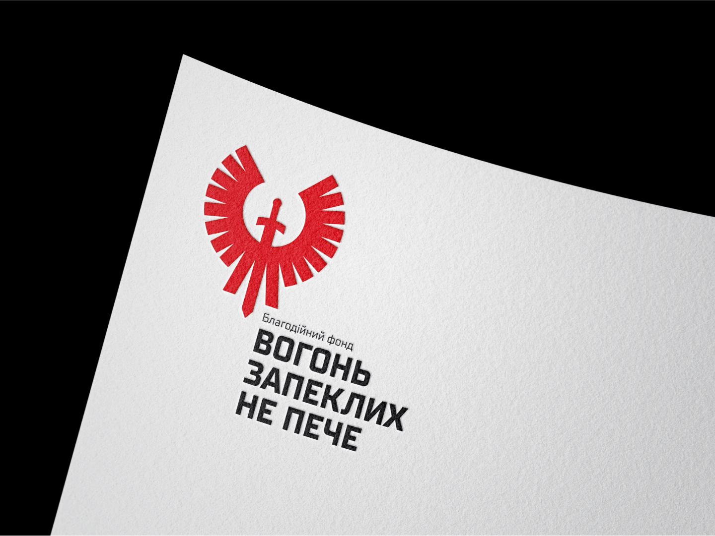
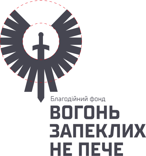
A stylized depiction of a sword transforming into wings or flames creates a distinctive symbol of strength, dignity, and resilience. The typographic component of the identity is bold, modern, and highly legible, reinforcing a sense of confidence and authority. Together, these elements form a powerful visual code that resonates with both the military and the civilian sector.
ELEMENTS OF CORPORATE IDENTITY
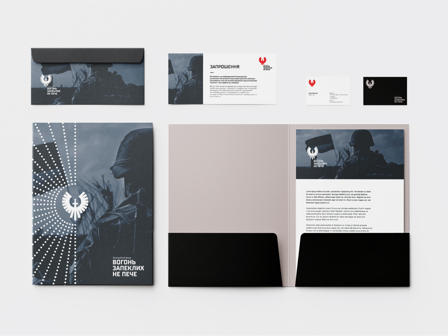
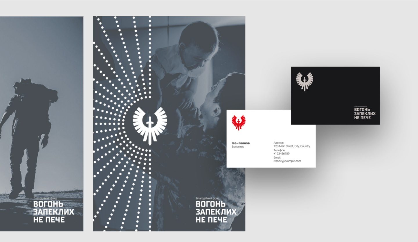
The style conveys a sense of determination, discipline, and mission focus. All elements are visually consistent, allowing the brand to remain recognizable across various formats — from printed invitations to presentation folders.
VISUAL COMMUNICATION
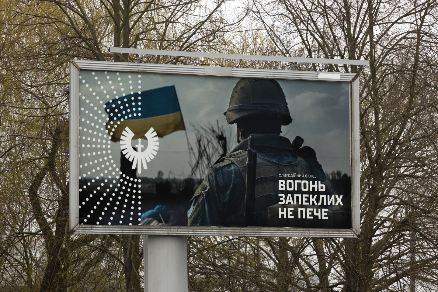
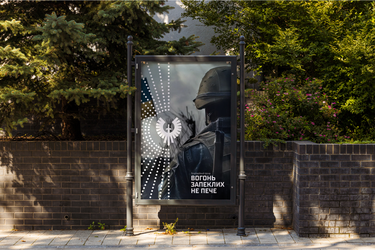
The visual communication elements of the "Vohon Zapeklykh Ne Peche" foundation stand out for their clarity, symbolism, and recognizability. The graphic pattern of concentric dots creates a dynamic composition around the logo, evoking a sense of motion and direction. This reinforces the core message: mission focus and action. The contrast between the dark background, monochrome images, and white elements creates a strong emotional impact, while the composition allows the style to be flexibly adapted across various formats — from billboards to social media.
TT Supermolot Neue TYPEFACE
TT Supermolot Neue is a strong, square grotesque typeface with distinctive wide letters and geometric forms. It combines industrial solidity with modern readability, making it ideal for brands with a bold, decisive tone of voice.
THE MAIN COLORS
Together, the colors of the "The Fire Doesn’t Burn the Fierce" brand create a visual language that conveys resilience, confidence, and transparency in both military and volunteer contexts.
#161719
R22 G23 B25
#e20813
R226 G8 B19
#cbc2bf
R203 G194 B191