Horonda Platform
Intermodal logistics center
Horonda Platform

Horonda is an innovative logistics platform and "dry port" located in Zakarpattia. It integrates intermodal logistics services, digital analytics, and cargo flow management tools. The platform is part of the NSV Group ecosystem.

Main objective: To develop a new brand for the platform that would emphasize its technological nature, reliability, and logistics expertise. The identity had to be flexible and adaptable across various communication channels — from presentations to dashboards — while maintaining a strong corporate character.

Project scope included:
– creation of a logo and visual system combining clean geometry with digital elements,
– development of a corporate color palette, typography, and graphic patterns,
– design of presentation materials, websites, digital templates, and marketing assets,
– brand implementation within the NSV Group platform.

Result: Horonda received a distinctive identity that fits seamlessly into the broader NSV Group brand while retaining its own voice. The brand highlights the platform’s innovation and digital expertise, builds trust, and enables its expansion to new markets.
Client
NSV Group
Year
2023
Role
Design
LOGO
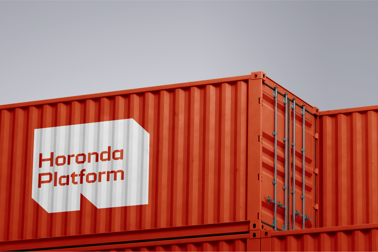
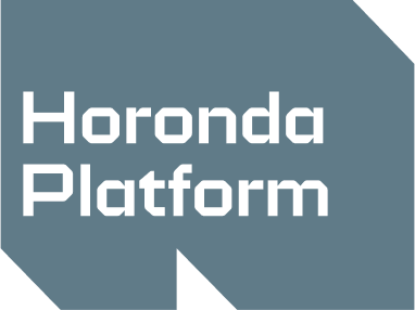
The Horonda Platform logo is a monolithic shape reminiscent of a container or industrial platform, featuring distinctive angles and cutouts. The strict geometry of the form symbolizes technological precision and structural clarity. The typeface reinforces this character: it is straightforward and technical, yet modern enough to function effectively in digital environments.
ELEMENTS OF CORPORATE IDENTITY
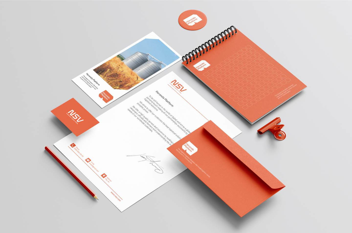
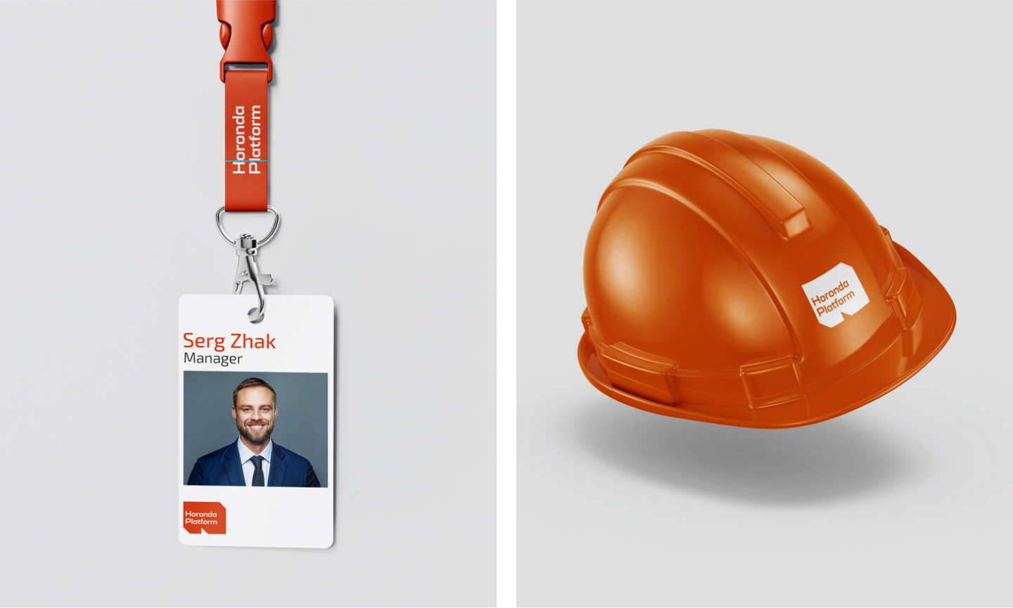
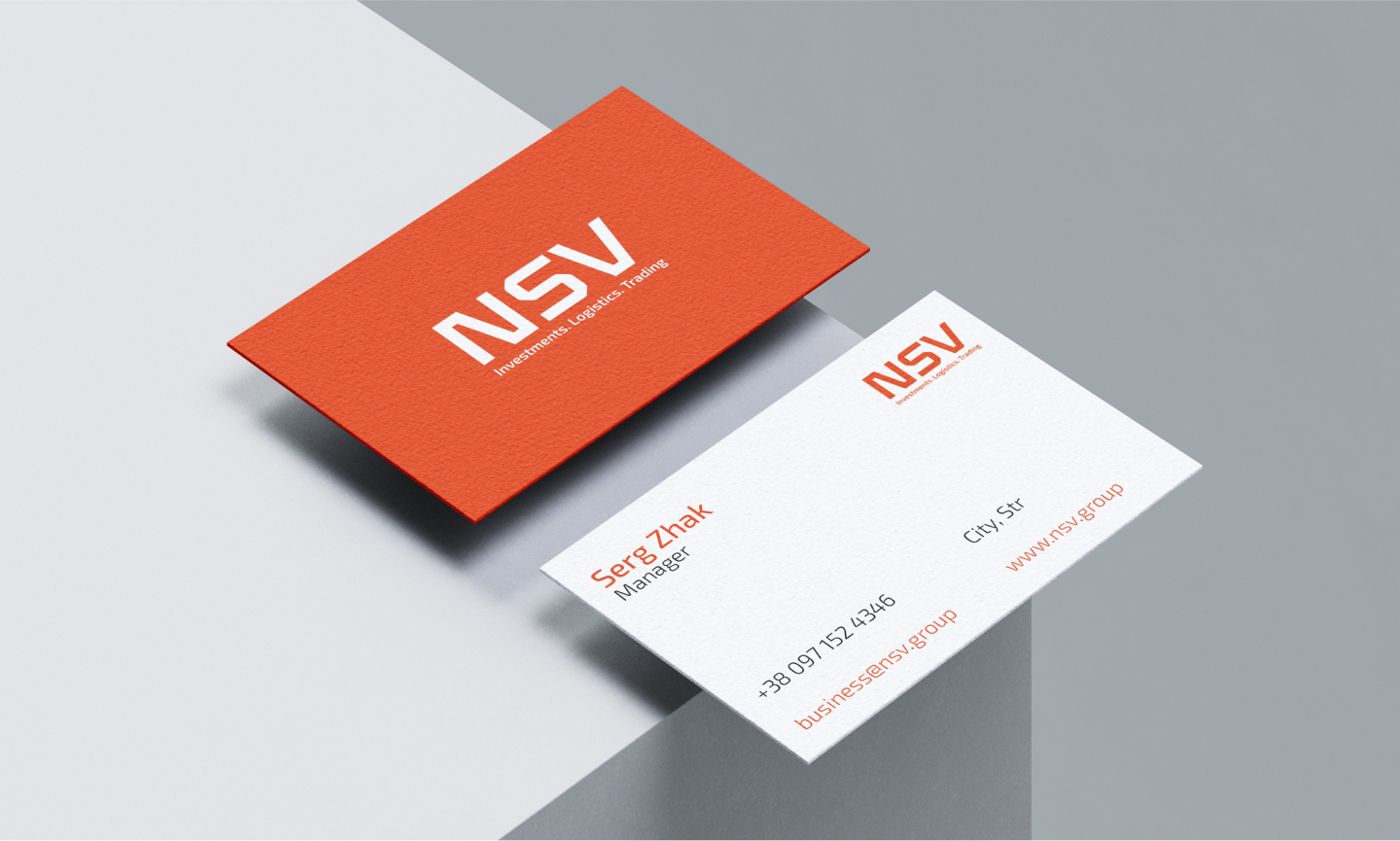
The corporate identity elements of Horonda Platform are designed in a minimalist, modern aesthetic. The main visual accent is a warm orange color that sets a dynamic yet restrained tone. The identity is built on geometric shapes and a clean grid, emphasizing the brand's structured and digital nature.
VISUAL COMMUNICATION
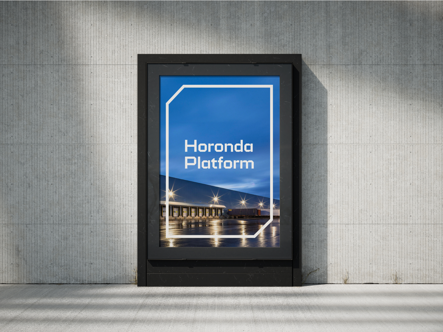
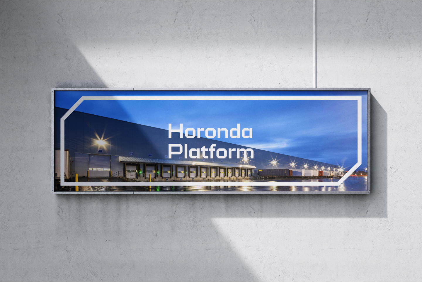
Visual communication elements of Horonda Platform demonstrate a clear, structured B2B solution. They are built on the principle of “direct brand speech,” featuring a clean, modern typeface and a distinctive geometric frame that visually connects the logo with the background image. This is an effective tool for partner communication, conveying transparency, readiness for cooperation, and technological competence.
EXO 2 TYPEFACE
Exo 2 is a modern geometric typeface with soft curves that combines a technical character with friendly readability.
THE MAIN COLORS
The core colors of the Horonda Platform identity create a bold yet balanced contrast that draws attention without being overly aggressive. Together, they form a modern visual language that resonates clearly within B2B communication.
#e84d24
R232 G77 B36
#102633
R16 G38 B51
#e9edf0
R233 G237 B240