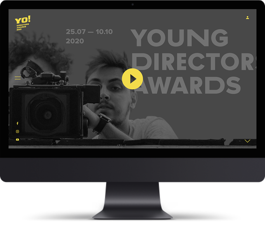

YoDs (Young Directors Award) is a nationwide competition for emerging commercial directors, initiated by Toy Pictures film productions. Its mission is to discover new voices in advertising direction, give a strong start to young talent, and build a bridge between ambitious newcomers and the professional industry.
The challenge: To create not just a website, but a full-scale brand — from the name and identity to the award’s creative concept and digital platform. The goal was to capture the spirit of openness, boldness, and visual sensitivity — key traits of young direction. The website had to be simple, emotionally engaging, and functional: allowing submissions, showcasing winners’ work, archiving past editions, providing jury information, and publishing updates.
The project included:
– the creation of the YoDa name and a creative concept combining youth and an auteur perspective,
– visual identity: logo, color system, typography, brand assets, and social media design,
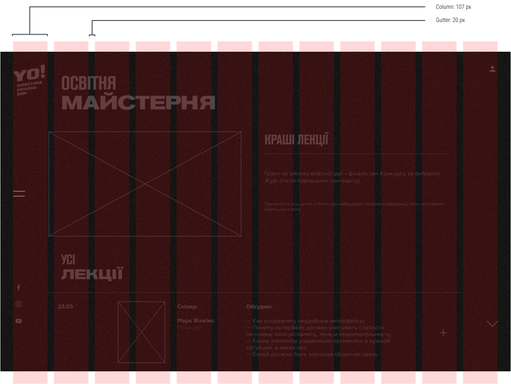
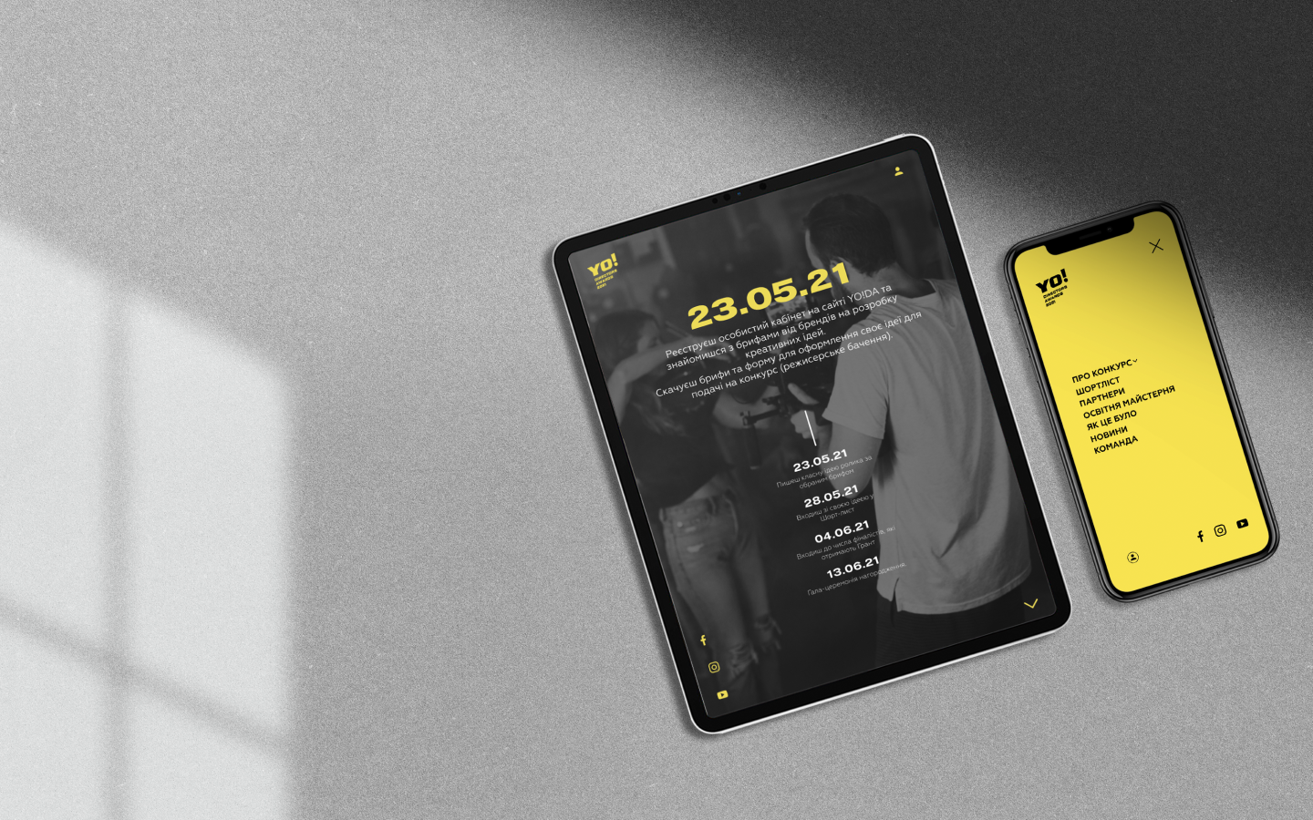
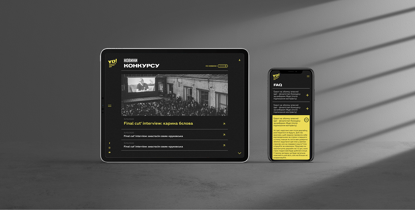
– a responsive website with intuitive navigation and a user-friendly flow for participants,
– submission forms, a nominee database, jury profiles, and a news section,
– full technical support and maintenance for two seasons of the competition — 2020 and 2021.
The result: YoDa built a vibrant community of young directors and became a key entry point into the profession for a new generation of talent. The website — simple, dynamic, and visually distinct — served as the brand’s central digital tool and a platform for dialogue between the industry and its future stars.
