
"Your support" is one of the largest charitable foundations in Ukraine. It provides consistent support to children's hospitals, cares for children with severe illnesses, assists people in crisis situations, and runs large-scale humanitarian initiatives. Since February 24, 2022, the foundation has also become a strong player in the field of wartime and post-war aid.
The challenge:
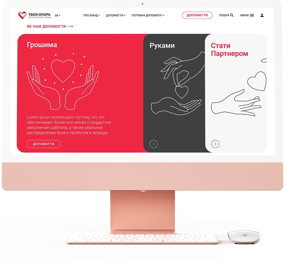
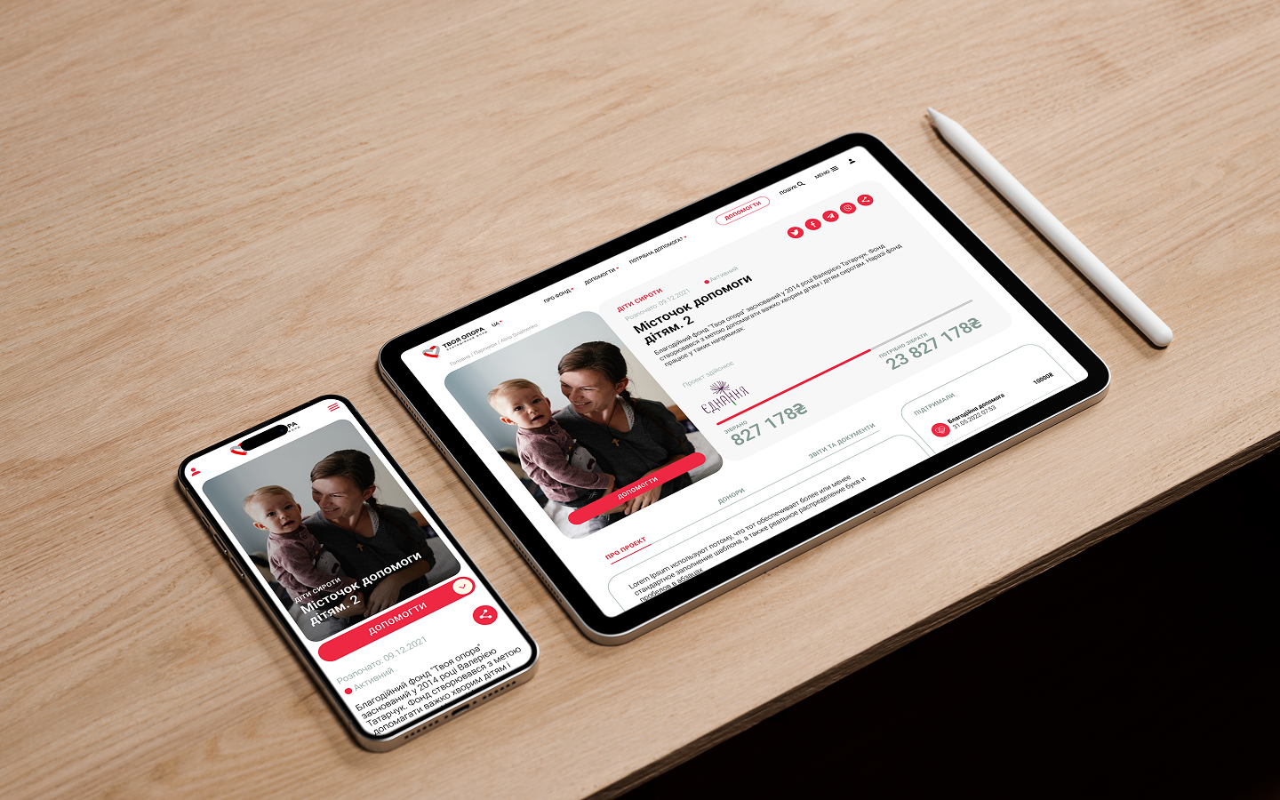
To develop a corporate website that serves not just as a showcase of projects but as a full-fledged digital platform for communication, fundraising, and building trust. The site needed to combine emotional depth with transparent reporting and user-friendly functionality for donations, participation, and partnership.
The project included:
– a responsive website with intuitive navigation tailored to different audiences — donors, partners, media, and beneficiaries,
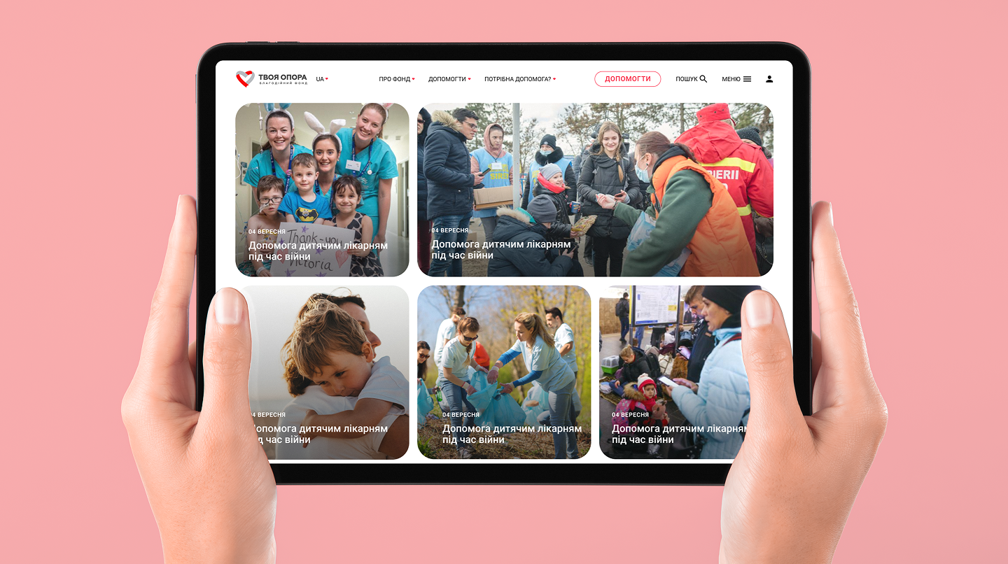
– sections featuring beneficiary stories, current initiatives, analytical reports, and news,
– deep integration with payment services (one-time, recurring, and international donations),
– multilingual support, SEO optimization, and compliance with WCAG accessibility standards.
The result:
The "Your support" website became the foundation’s central digital hub — one that inspires, informs, reports, and mobilizes. It’s user-friendly for the public, flexible for the internal team, and transparent for partners and donors. This is what trust in action looks like.
