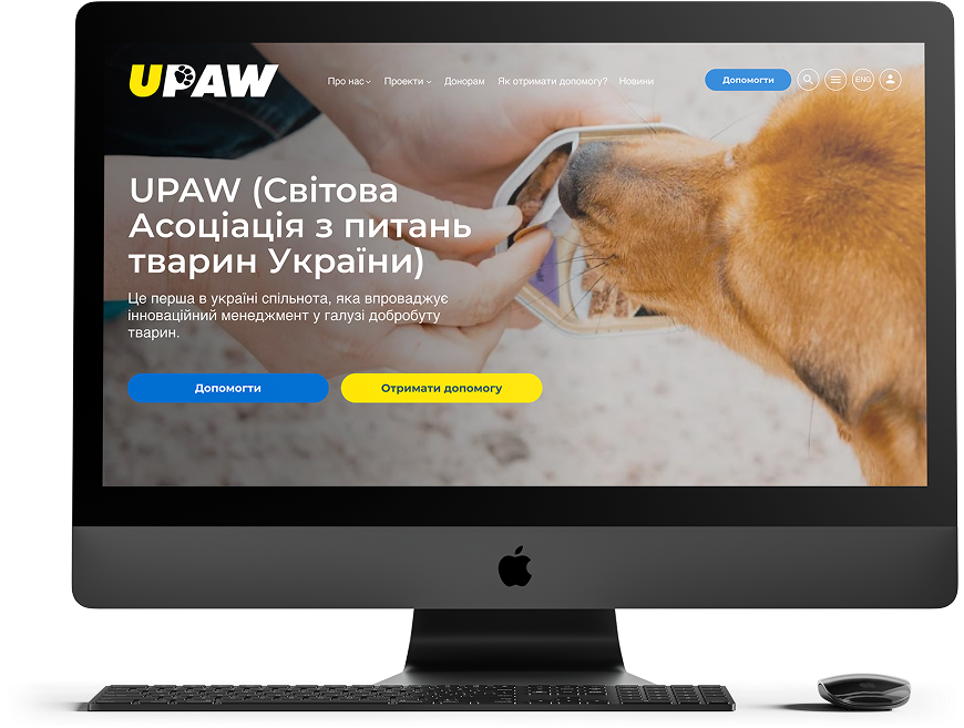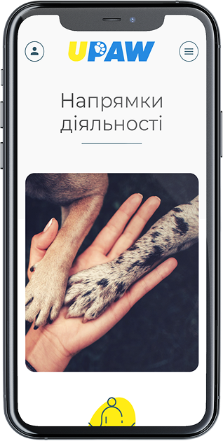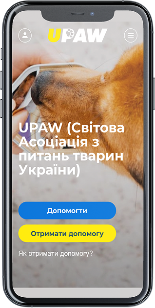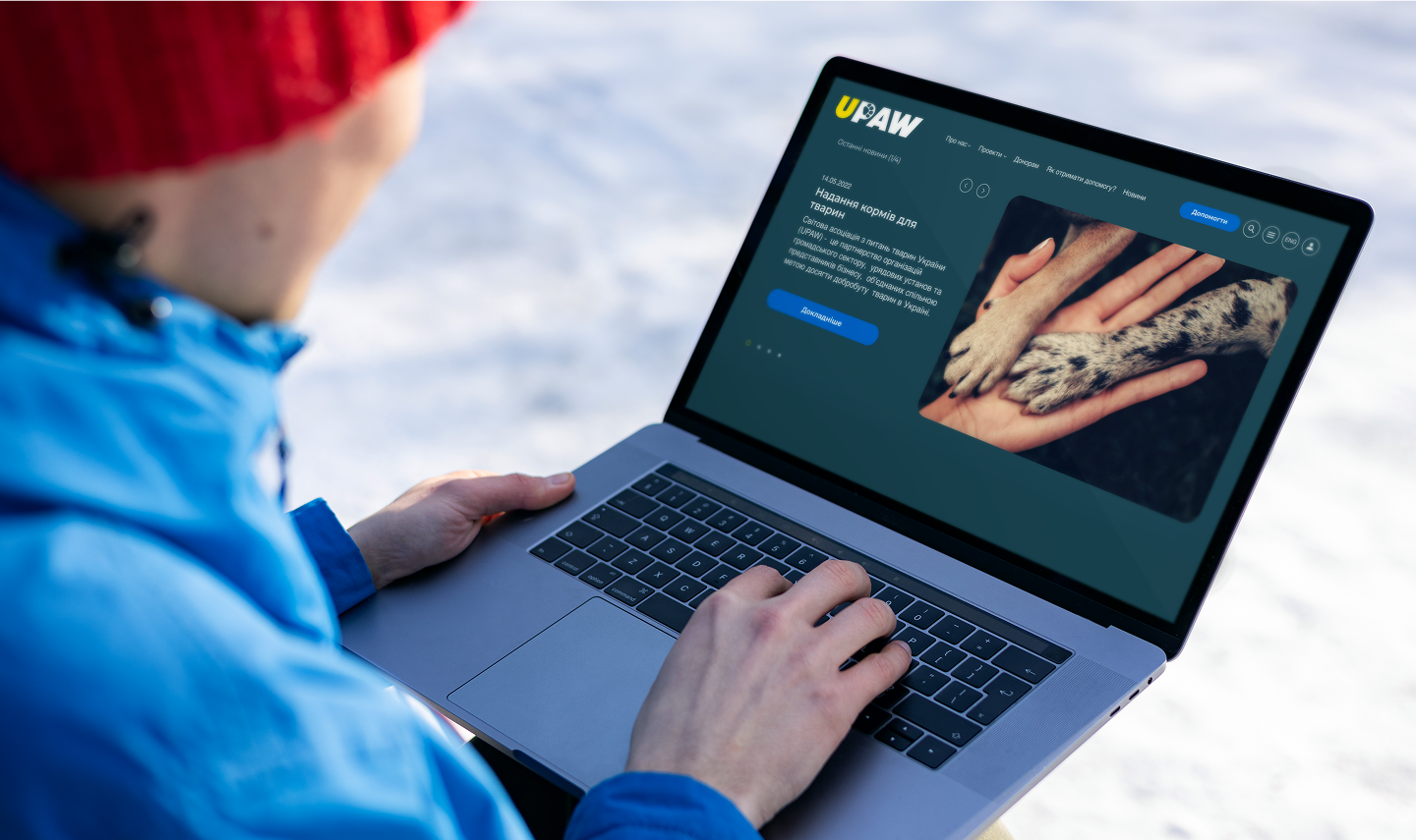

UPAW (Ukrainian Pet Association Worldwide) is a platform that coordinates aid for animals during Russia’s full-scale invasion of Ukraine. Launched in 2022, it brings together government agencies, international animal welfare organizations, volunteers, and charitable foundations. UPAW is more than just a humanitarian hub — it’s a digital infrastructure for transparent logistics, aid distribution, and tracking the needs of shelters and pet owners.
Main objective: To create a website that functions simultaneously as an informational portal, humanitarian coordination center, and online tool for applications and reporting. The interface had to be intuitive for both international partners and Ukrainian users. Transparency, multilingual support, and quick navigation in crisis conditions were top priorities.
Project scope included:
– UX research for different target audiences: volunteers, partners, shelters, donors
– multilingual interface (Ukrainian, English, German)
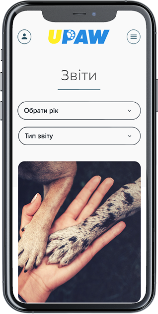
– real-time catalogue of needs and reports
– donation modules, CRM and logistics service integrations
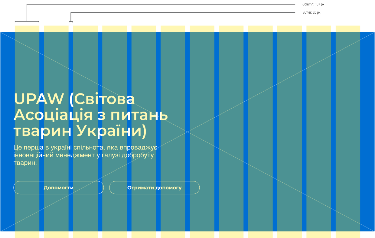
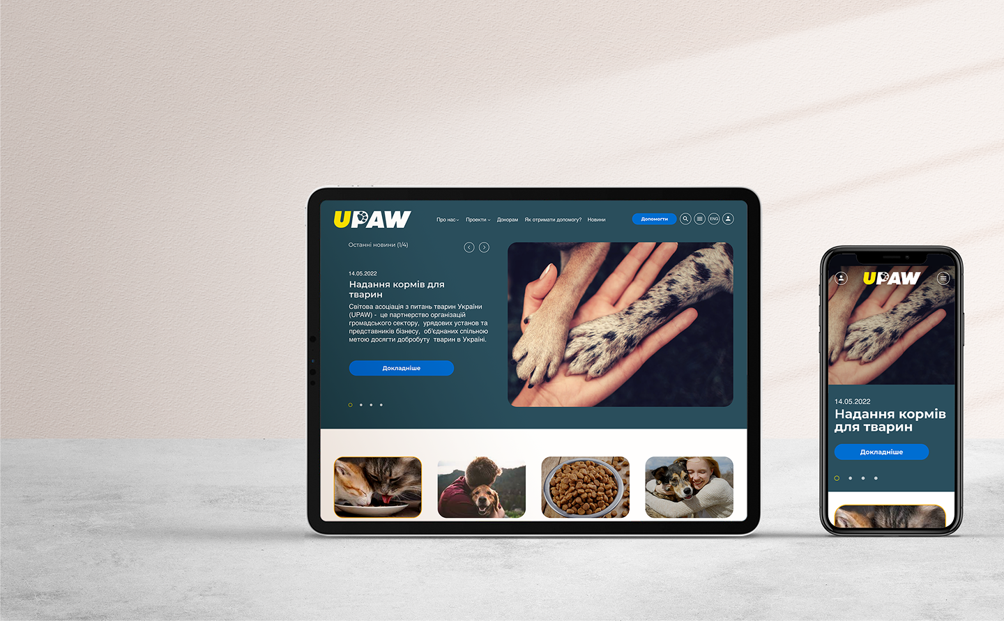
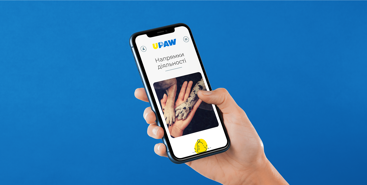
– responsive design for all devices
– visual style focused on trust, empathy, and operational clarity
Result: UPAW received a modern humanitarian platform that handles both communication and technical tasks. It helps save thousands of animals, engages international support, and sets a new standard for digital animal welfare coordination in times of war.
